

Intro
A Design System for 2,500+ Advisor Websites
I built a modular, accessibility-first design system that lets each advisor tell their distinct story while keeping the institution's brand and compliance intact.
Role
UI Designer and Developer
Problem statement
Problem statement
Advisors were stuck in identical templates
Advisors needed scalable personalization without costly custom development.
Building institutional trust
The institution needed to preserve brand standards and WCAG 2.2 AA compliance.
Thinking Bigger
Thinking Bigger
Replacing rigid templates with adaptable building blocks that enable personalization, brand consistency, and accessibility.
Discovery
Discovery
Understanding Advisor Success
By analyzing internal traffic insights, reviewing competitor sites, and evaluating current websites, I identified key gaps in the user experience. Stakeholders expressed frustration with low engagement, high drop-off rates, and limited personalization options. I prioritized improvements on the most visited pages and conversion points, directly addressing these concerns and resulting in increased engagement and higher conversion rates.
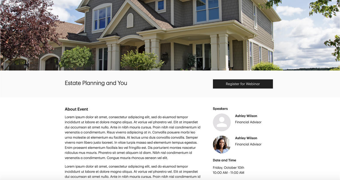
Home
Main landing page
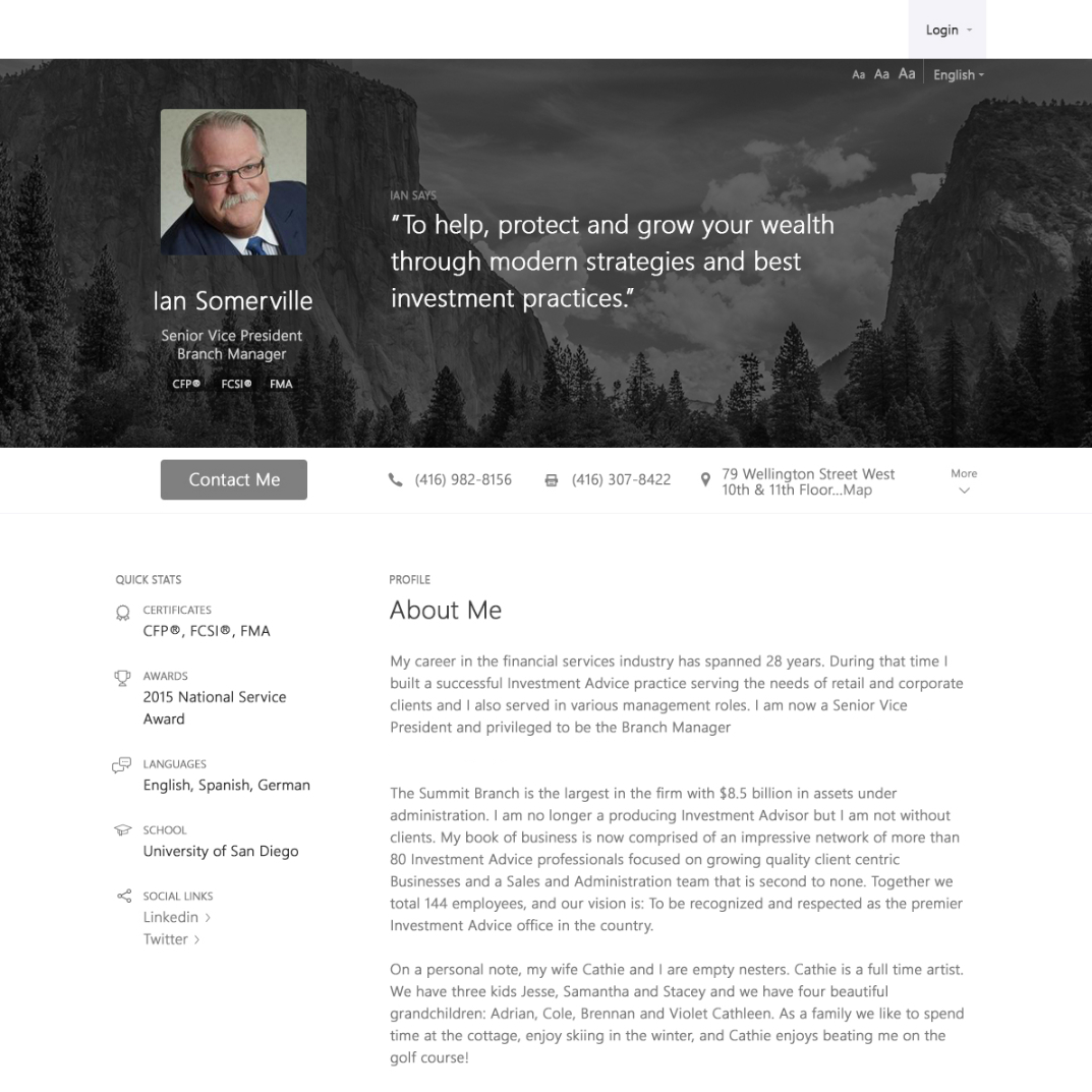
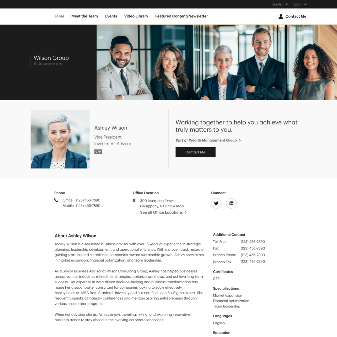
About/Bio
Advisor's background and credentials
Services
Overview of services offered
Contact
Contact information and form
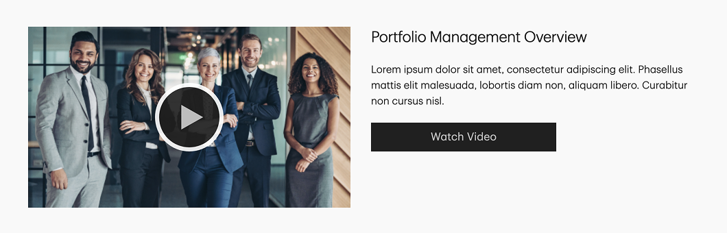
Blog
Educational articles
Lead Generation
Gated content leads
Newsletter
Email sign-ups
Design Process
Design Process
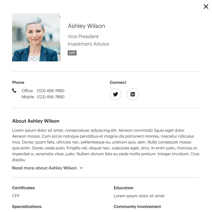
Building Blocks for Personalization at Scale
I created 30+ interchangeable components that can be mixed and match to compose pages around an advisor's strengths. Each component includes content guidance, responsive layouts, and built-in accessibility rules so advisors can personalize freely without breaking the brand or WCAG 2.2 AA compliance.
Foundation Layer
Customizable headlines, messaging, and CTAs that highlight value props
Strategic Enhancements
Rather than rebuilding from scratch, I upgraded existing sections so advisors could keep their content while presenting it more clearly. Reusing content cut rebuild time and made the transition seamless for advisors.
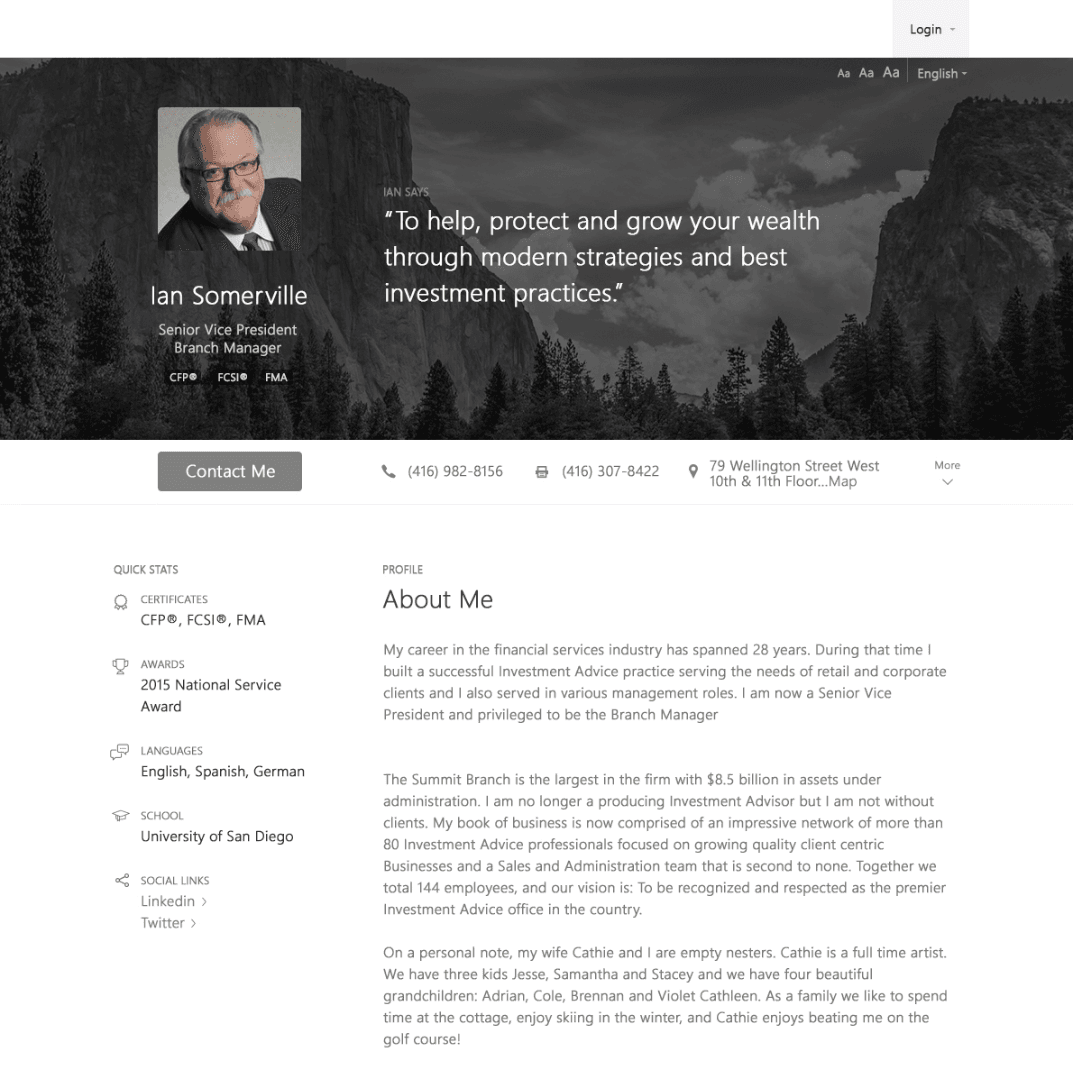
Individual Intro
Before
Forced identical layouts with background images and overlaid text reduced readability, limited accessibility, and restricted personalization
High-Fidelity Prototyping
Weekly feedback sessions with interactive prototypes let stakeholders shape the components and provide clear direction for development.
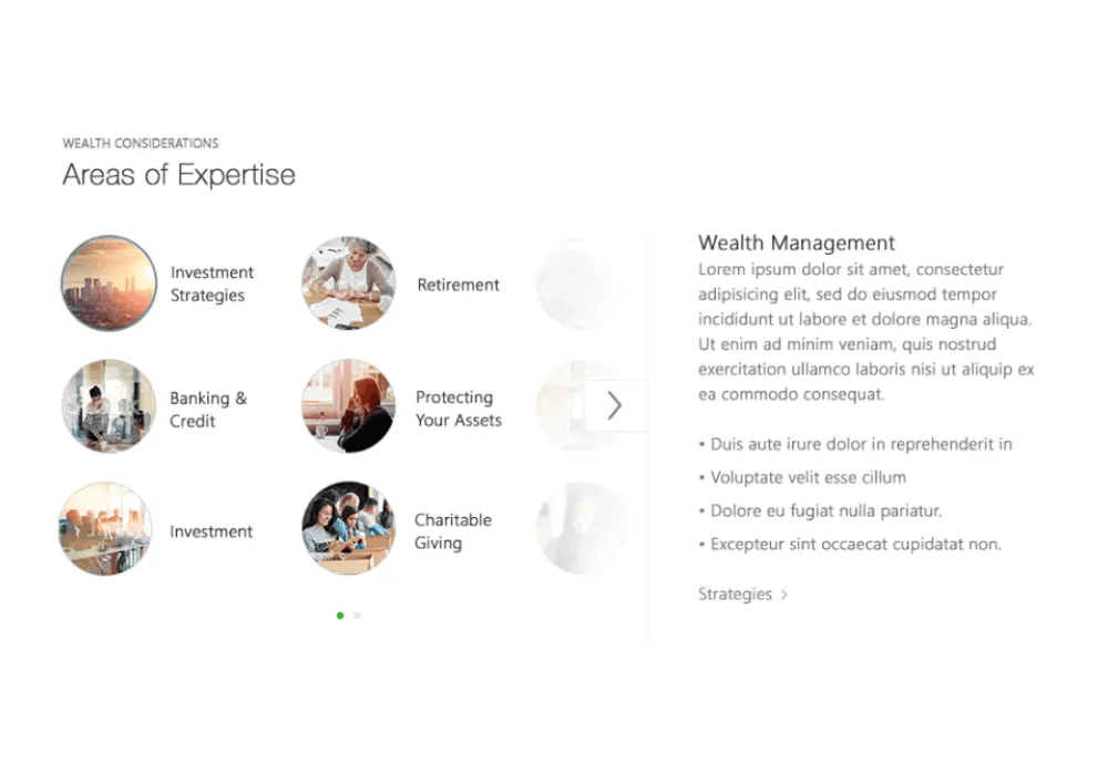
Tabbed Category Bar
1st iteration
Limited categories and pushed main content down making the page feel crowded and reduced immediate discoverability
Development Solution
Development Solution
Modular, Cohesive, and Conversion-Ready
After validating prototypes, I built an accessibility-first modular component library that delivers consistent UI and conversion gains. Each component is designed around three priorities:
Accessibility built in
Components meet WCAG 2.2 AA with semantic HTML, keyboard-first navigation, clear focus and state visuals, ARIA live regions for dynamic updates, and good color contrast.
Scalable code and layout
Centralized brand variables, responsive layouts, and configurable assets for fast, flexible rollouts.
Discovery & engagement
SEO-friendly markup, a robust asset library, and accessible interactive features that increase findability and conversion.
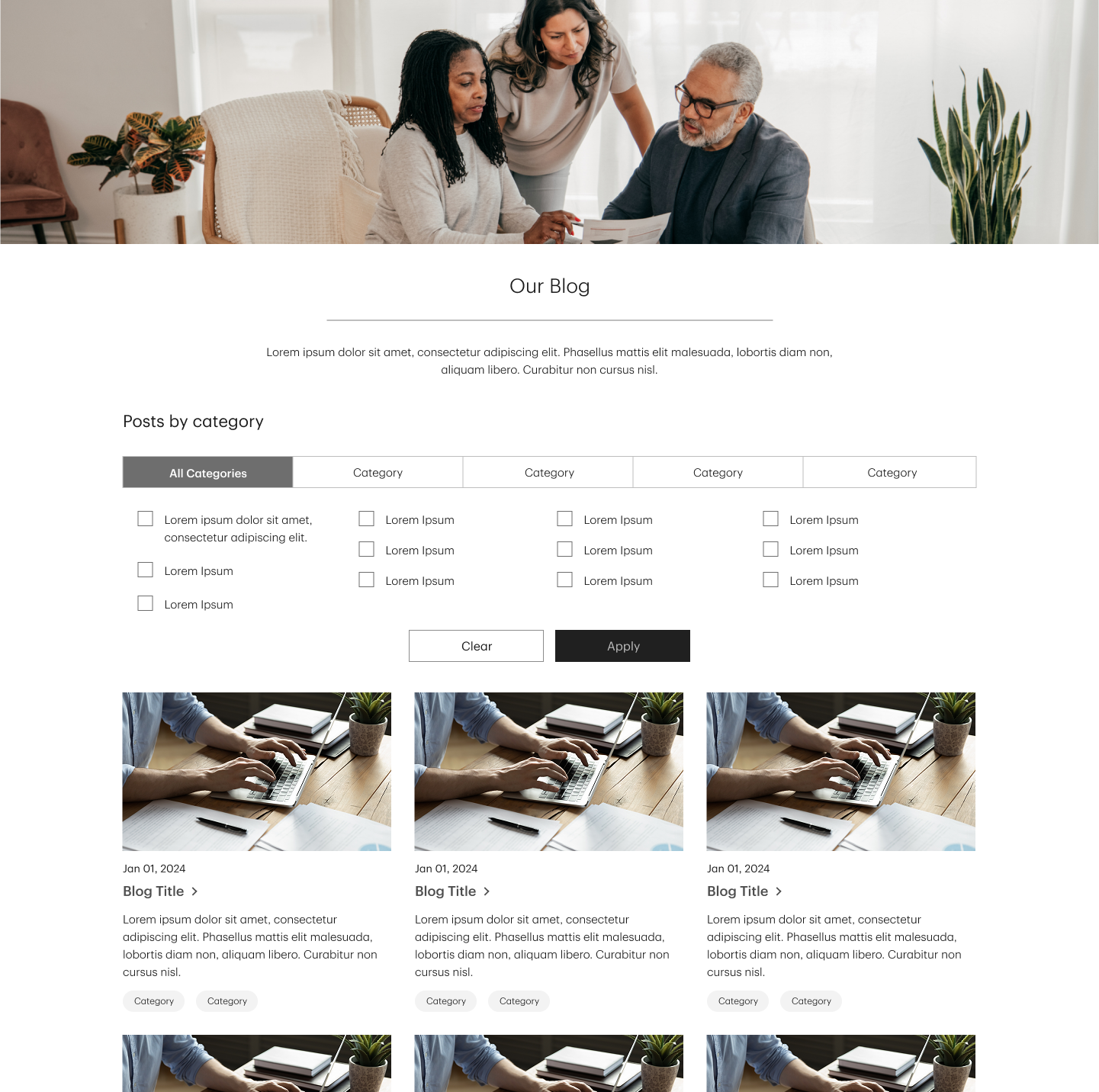
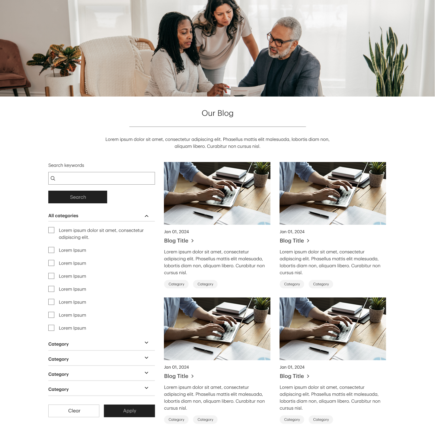
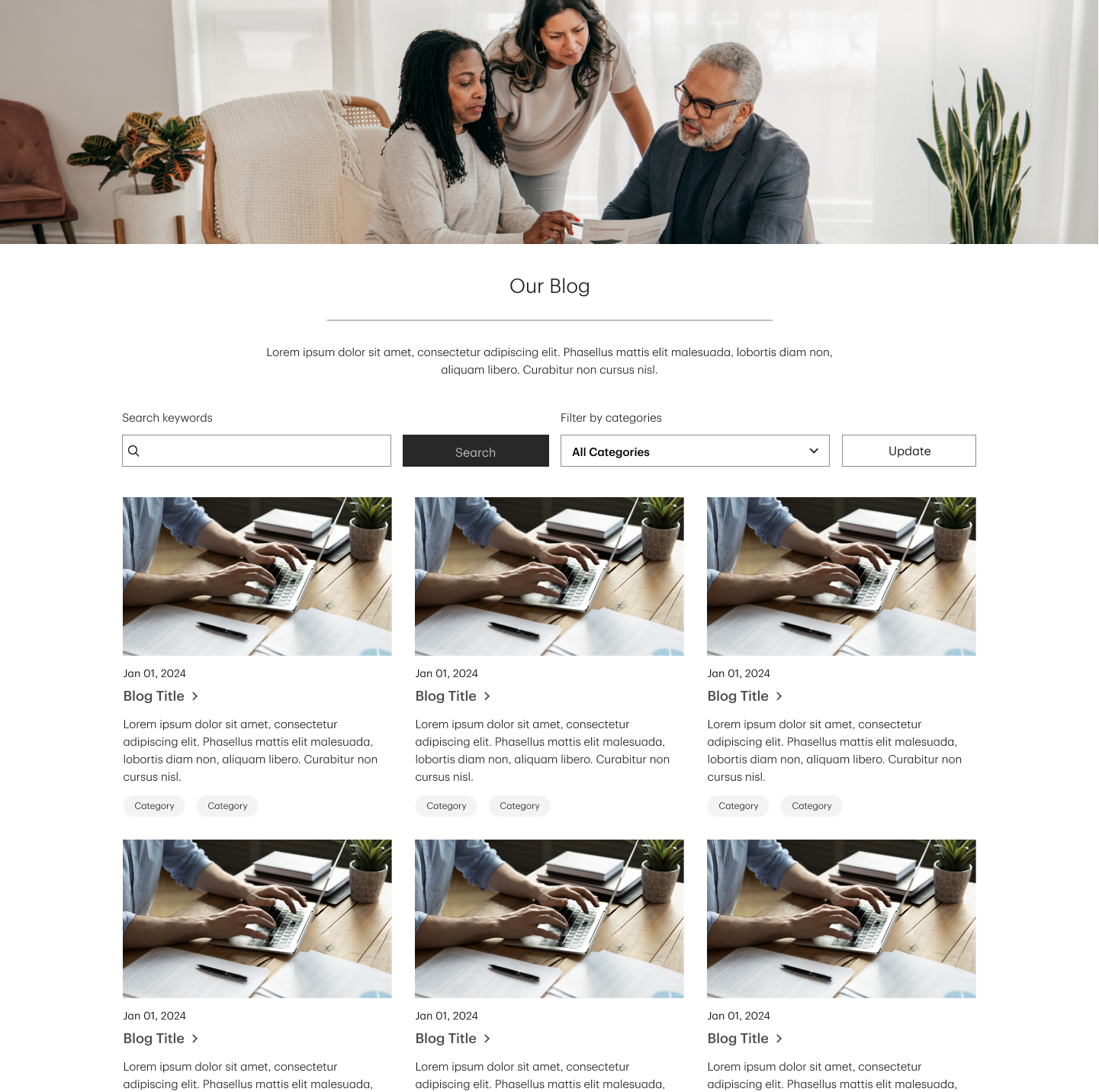
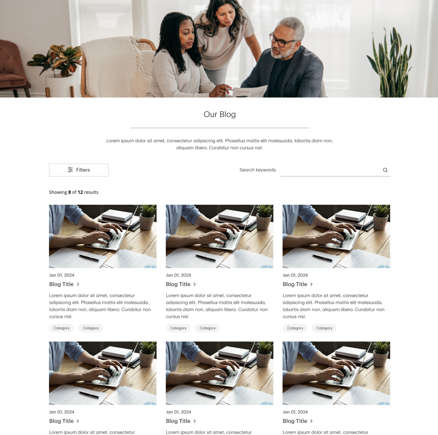
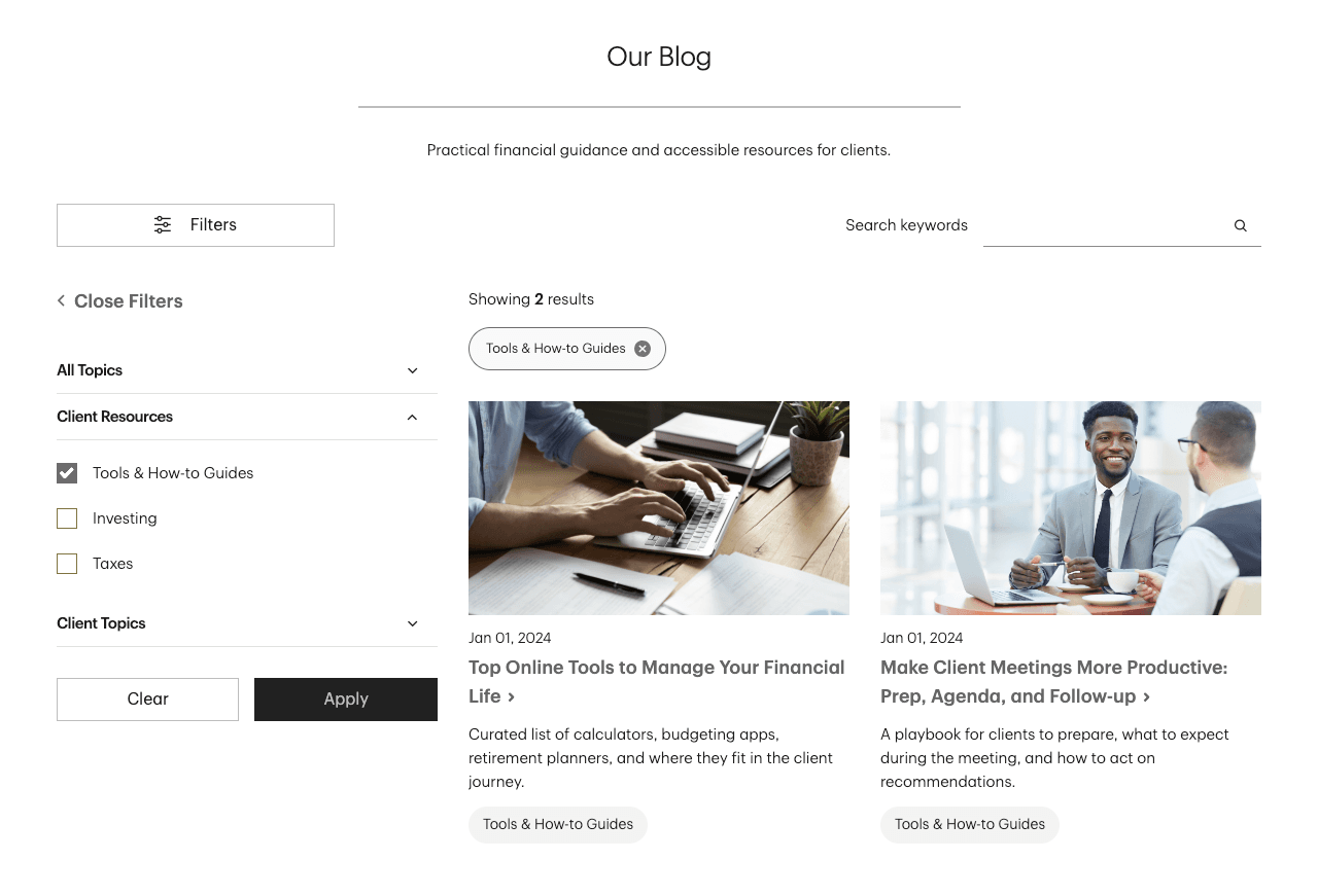
A Closer Look: Accessible Search & Filters
Accessible blog component that pairs keyword search with collapsible category filters and explicit user-state feedback, ensuring smooth use on all screen sizes.
Results & Impact
Results & Impact
Solving the Personalization-at-Scale Challenge
The modular design system transformed how 2,500+ advisors present themselves online through individual branding while strengthening institutional trust.
faster deployment
Reduced custom build time from one month to one week
unique advisor experiences
Differentiated while remaining on-brand
accessibility compliance
Zero WCAG-related complaints since launch
monthly visitors
Optimized user journeys that improved engagement and conversions
Conclusion
Conclusion
The design system transformed generic advisor sites into personalized experiences that deploy faster and perform better. The biggest challenge was content strategy: ensuring the library could support every advisor's needs. The priority wasn't just a new look and feel it was making sure the robust library encapsulated the needs of all advisors.